
These redesigns were created independently using existing business websites as a starting point. For each project, I identified opportunities to improve visual hierarchy, content organization, and user experience, then redesigned the homepage to explore an alternative approach.
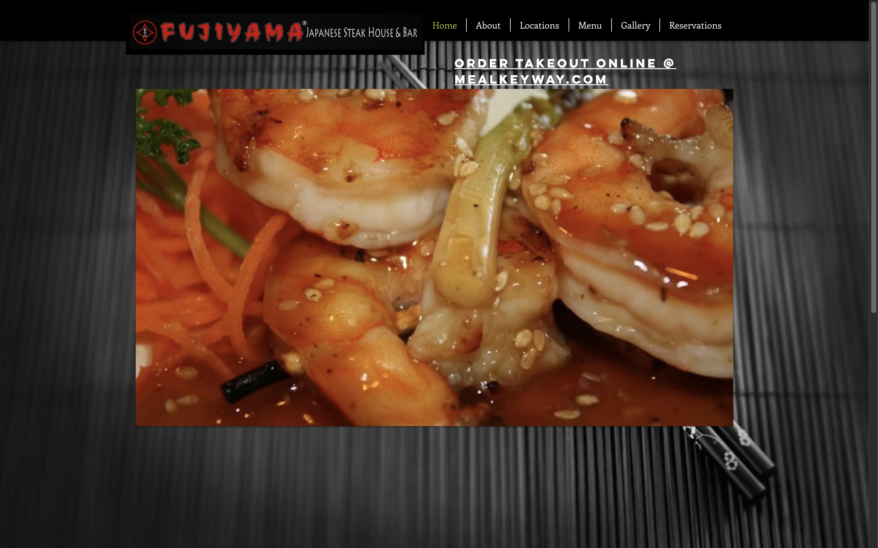
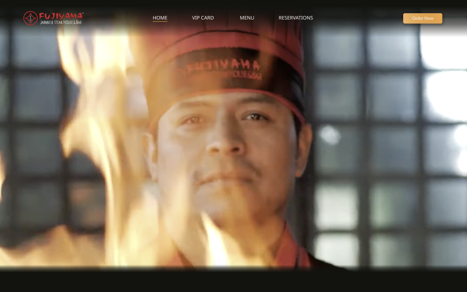
The original site was busy and low contrast, with a food photo floating awkwardly over a striped background. I replaced it with a full-bleed hero of a chef mid-flame, a minimal dark navigation bar, and tightened up the layout so the restaurant's atmosphere comes through immediately. The redesign feels like the dining experience instead of fighting against it.
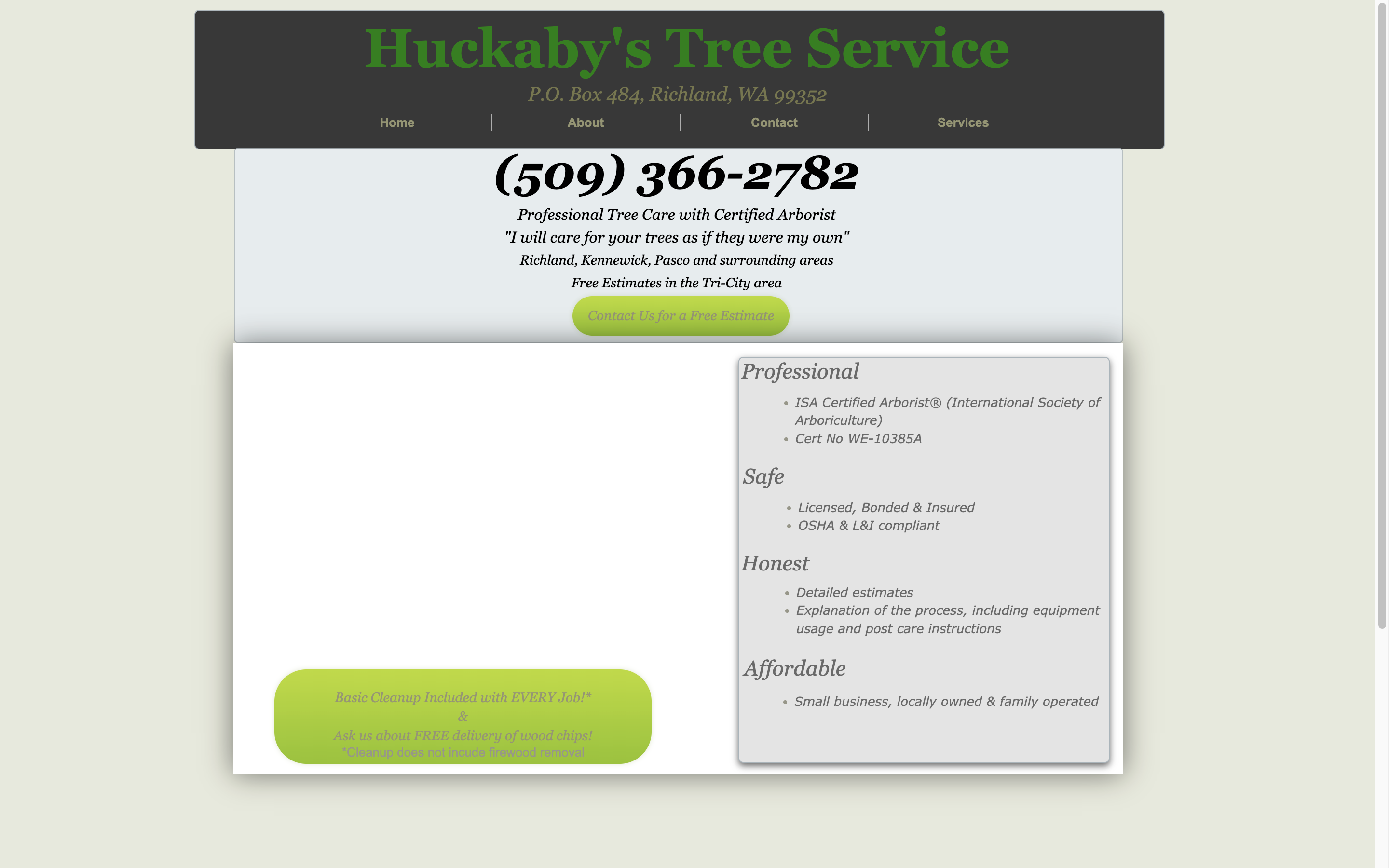
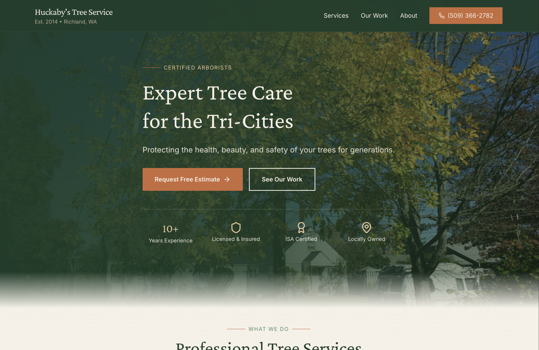
The original looked like it was built in the early 2000s, plain white background, green text, no structure. I brought in a deep forest green color scheme that actually fits the industry, organized their credentials and service area into scannable sections, and added a prominent phone number and quote button at the top. It goes from looking like a Craigslist ad to something a certified arborist would actually be proud of.
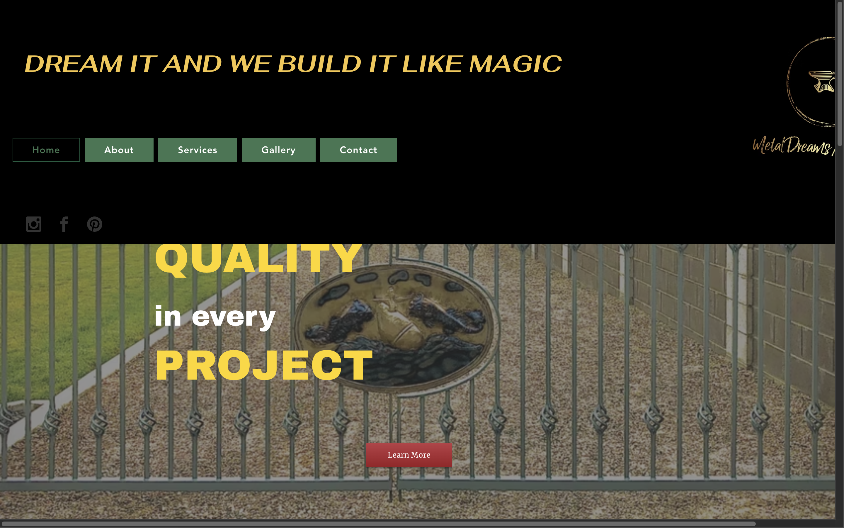
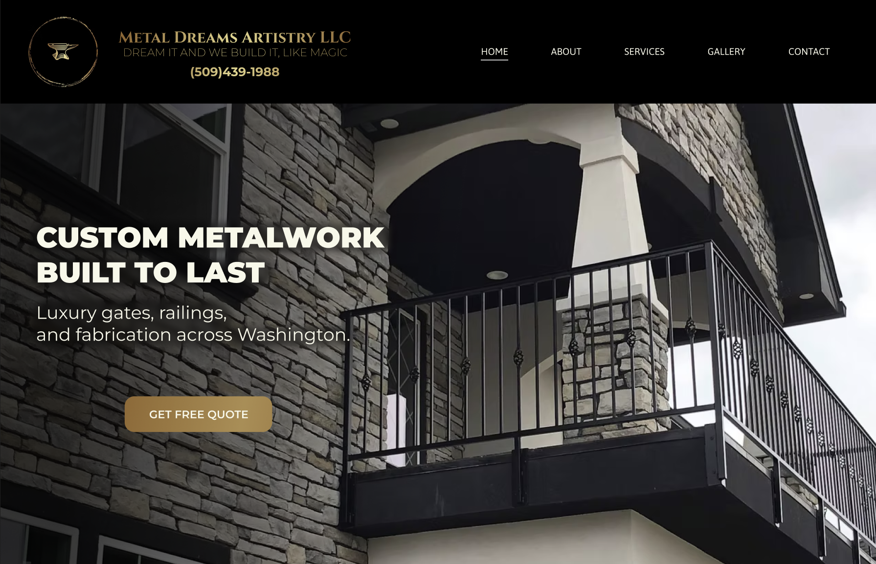
The original site used a chaotic mix of yellow text, red buttons, and a dark cluttered layout that made it hard to take seriously. I simplified the color palette to black and gold, led with a real photo of their metalwork front and center, and added a clean headline that actually communicates what they do. "Custom Metalwork Built to Last" does more work than "Dream It And We Build It Like Magic."